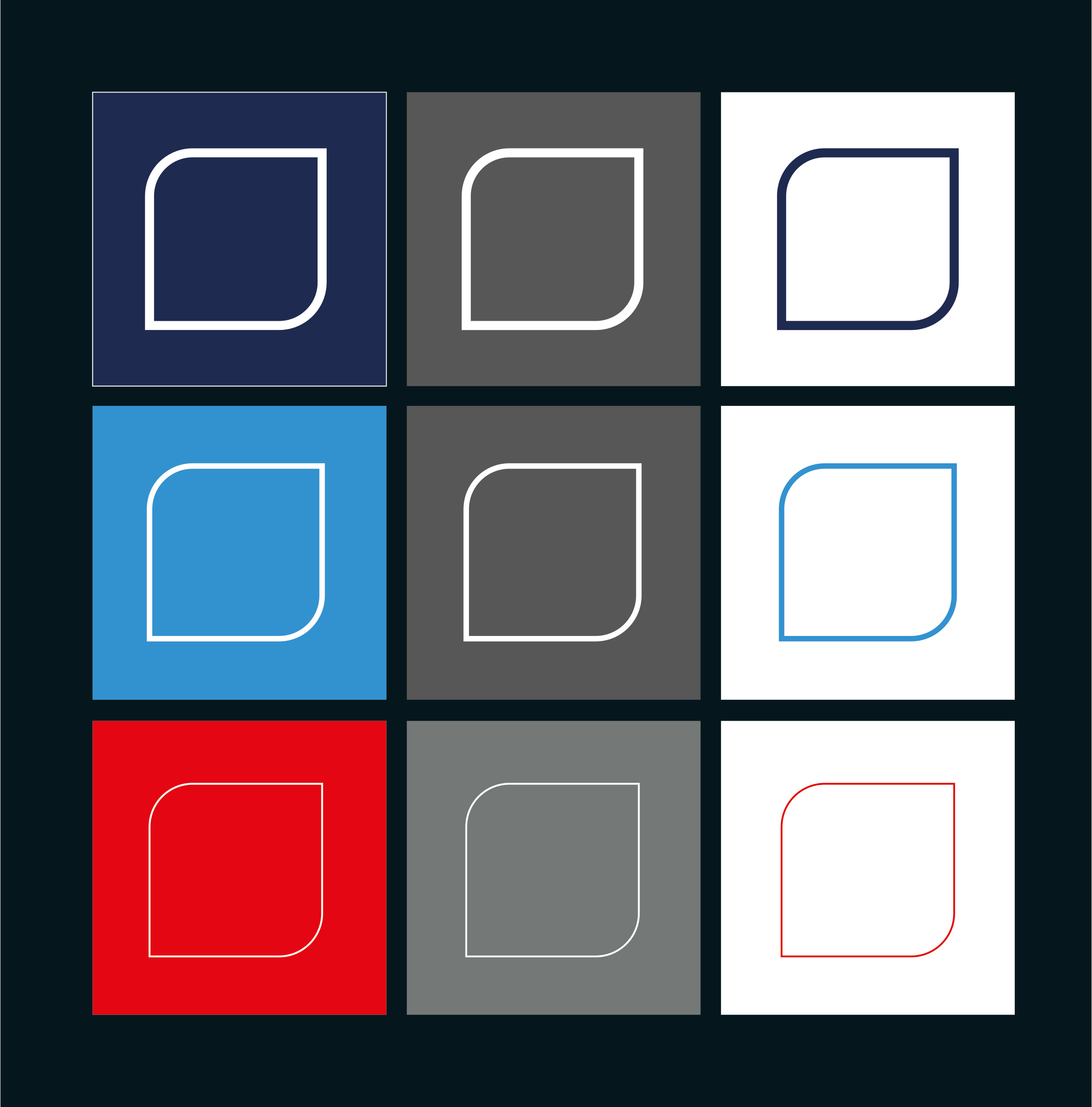
Visual
No frills. No effects. And – depending on the background and company segment – just blue, light blue, red, white or black. The new visual represents MULTIVAC’s old figurative word mark and, as a new visual, forms a central key element for representing the brand. It is used group-wide as a visual for all subsidiaries of the MULTIVAC Group.
The visual may only be used in combination with the company logo!
Requirements

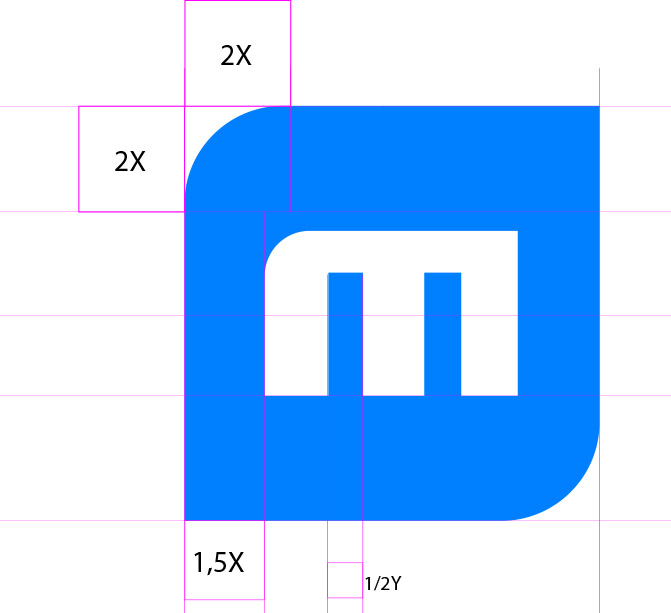


The visual may only be used in combination with the company logo!
Application examples


Visual in bleed
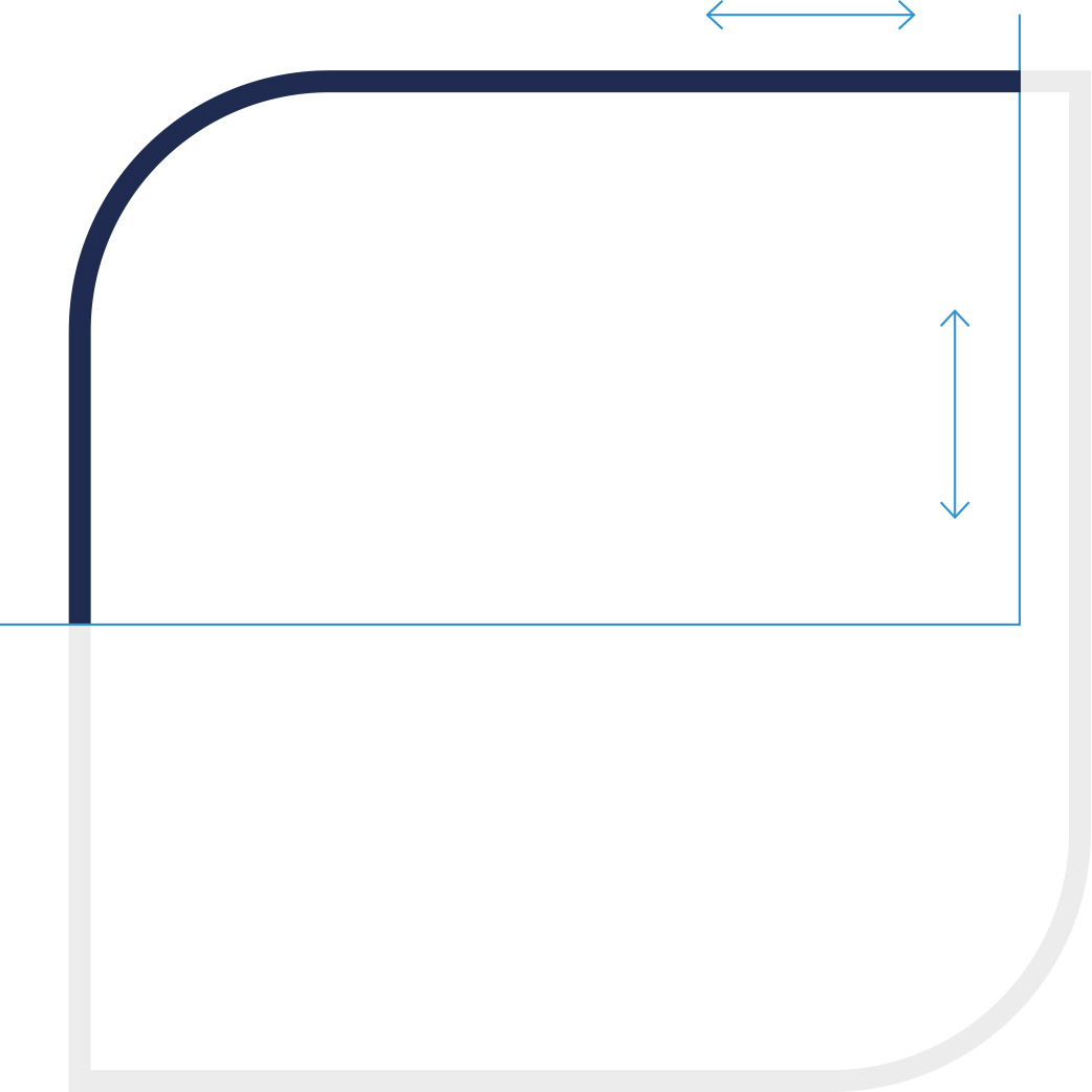
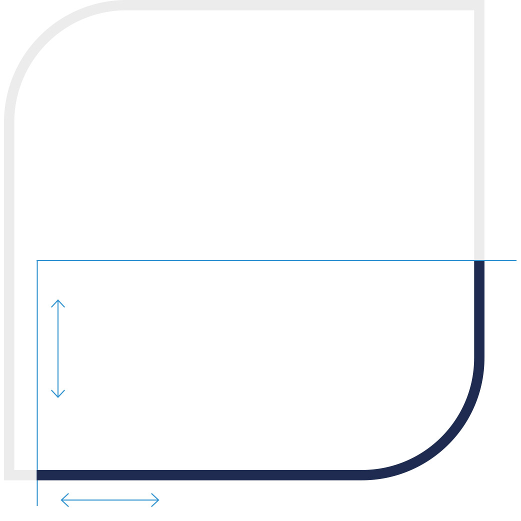
The visual can be cropped horizontally from the bottom | top and | or vertically. The following applies to every cut: The geometric shape of the trademark must be clearly recognizable. A bleed that cuts all rounded corners is not allowed. The visual is not cut by adjacent images and | or areas – unless it is a functional interaction area.


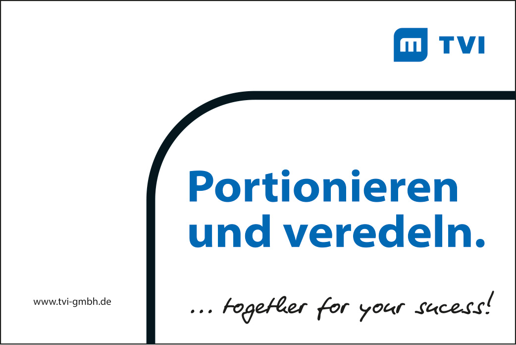




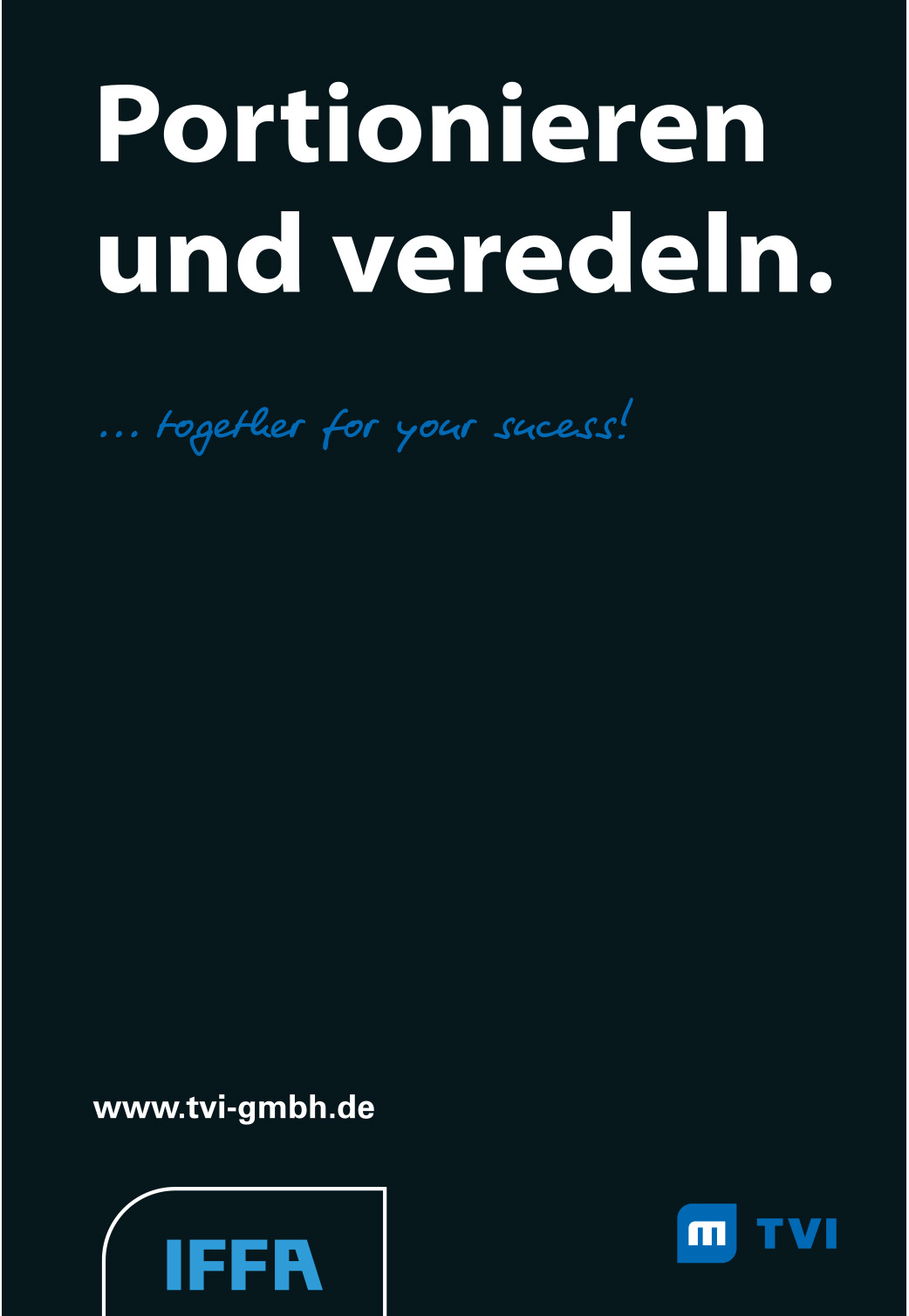
Not allowed
The visual can be cropped horizontally from the bottom | top and | or vertically. The following applies to every cut: The geometric shape of the trademark must be clearly recognizable. A bleed that cuts all rounded corners is not allowed. The visual is not cut by adjacent images and | or areas – unless it is a functional interaction area.
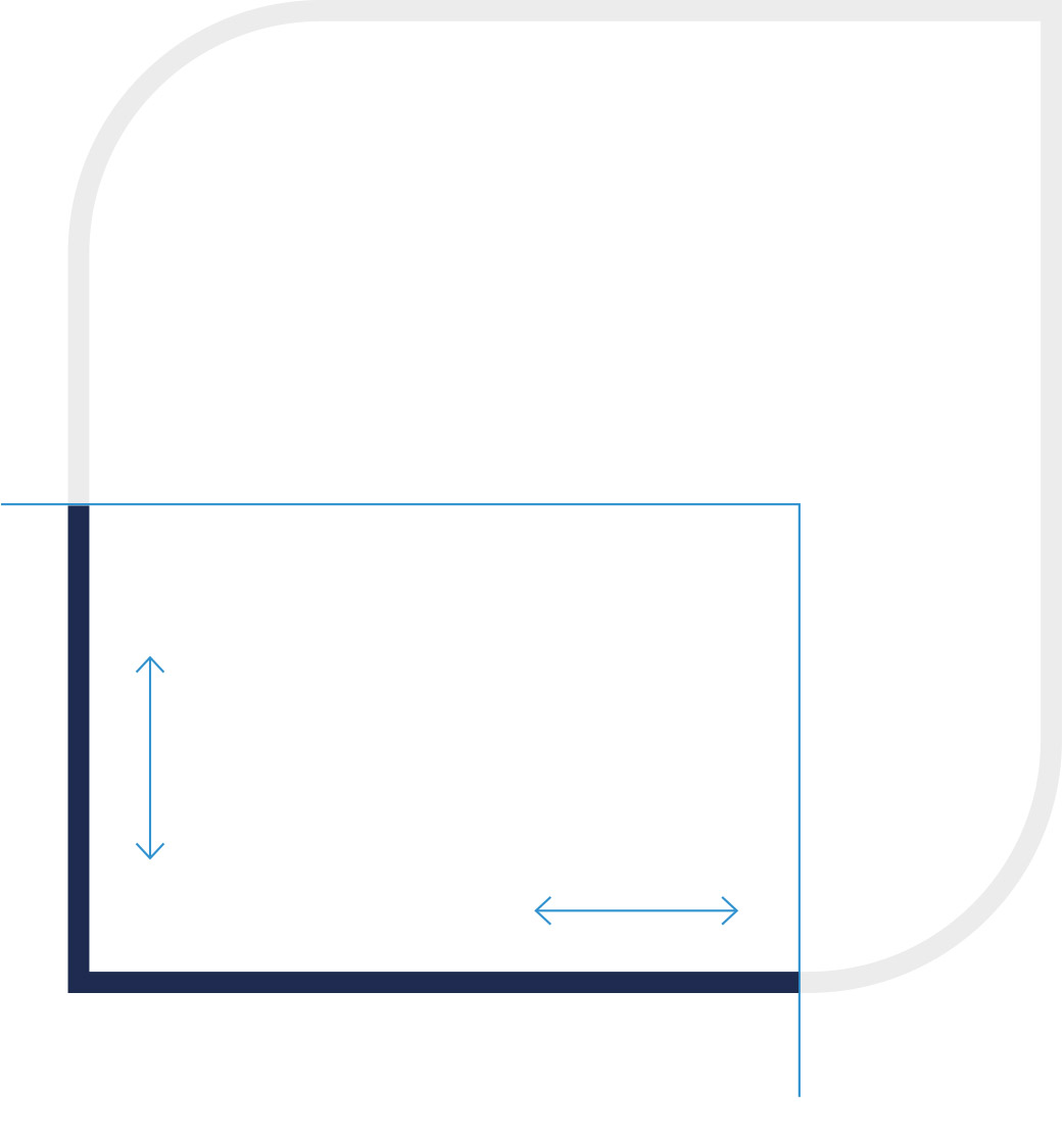
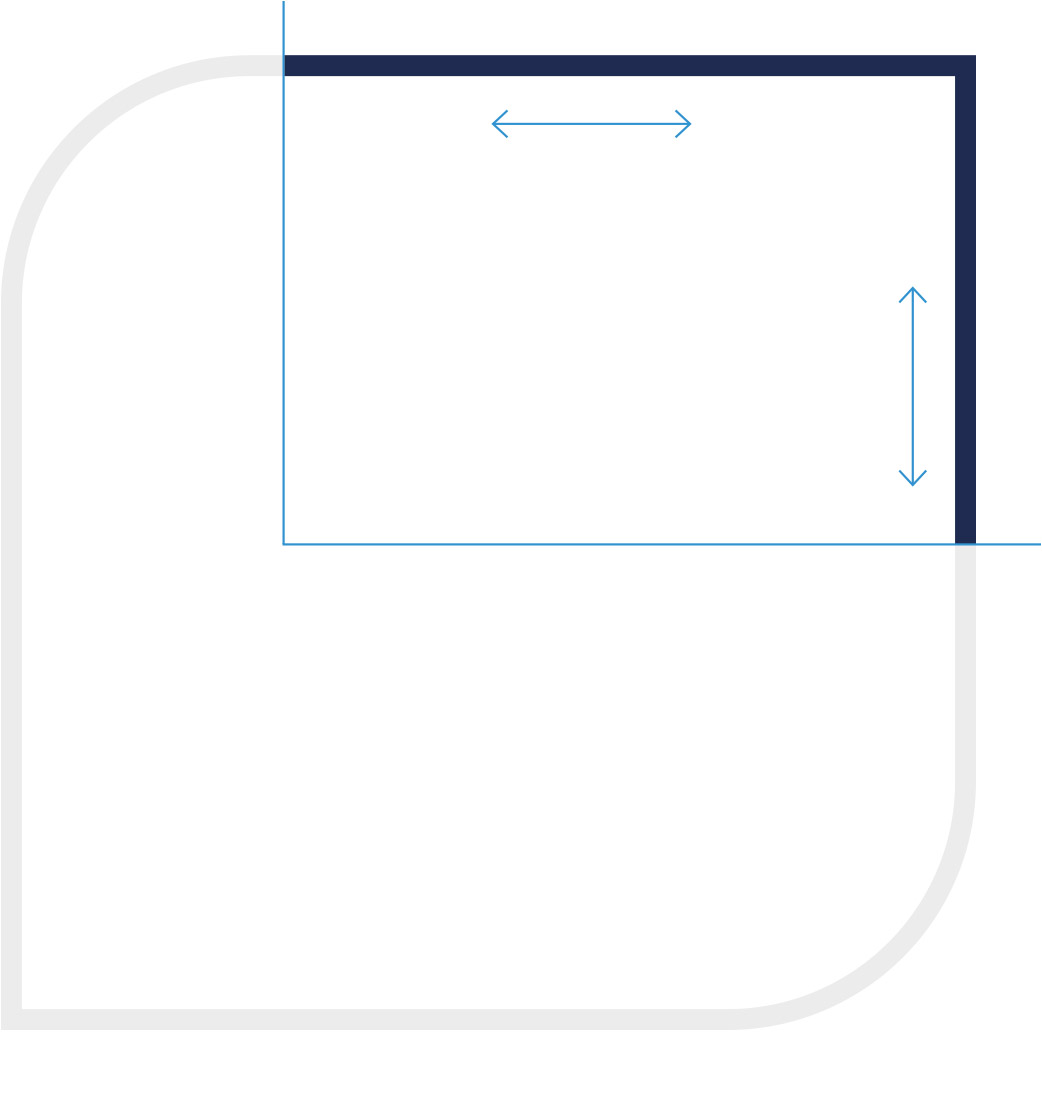


Ratio, minimum size and spacing
Minimum size
Regardless of the line thickness, the visual should appear optimal at any size.
The minimum size is 24px for digital applications and 5mm positive and 10mm negative for print media.

Distances
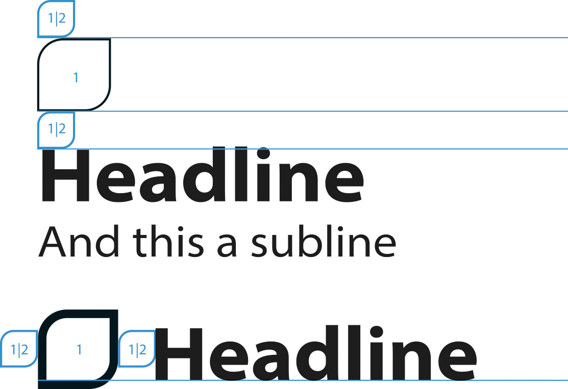
The spacing between the visual and the text can be freely chosen for an independent appearance of the visual. However, half the height of the visual should not be used as the minimum space above and below. At the left and | or right edge of the visual, the minimum spacing is also half a width.
Ratio
In principle, the ratio between the visual and the typography can be chosen freely. The visual works best with the text when the cap height is 70% of the visual’s outer height. Further key figures (26% and 11,5%) can be derived from this (see figure). But that is only as a guide.

Application examples
