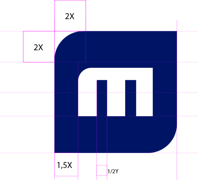
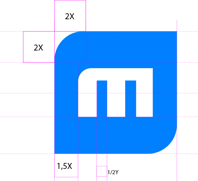
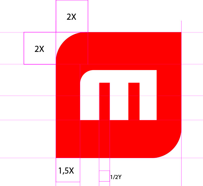
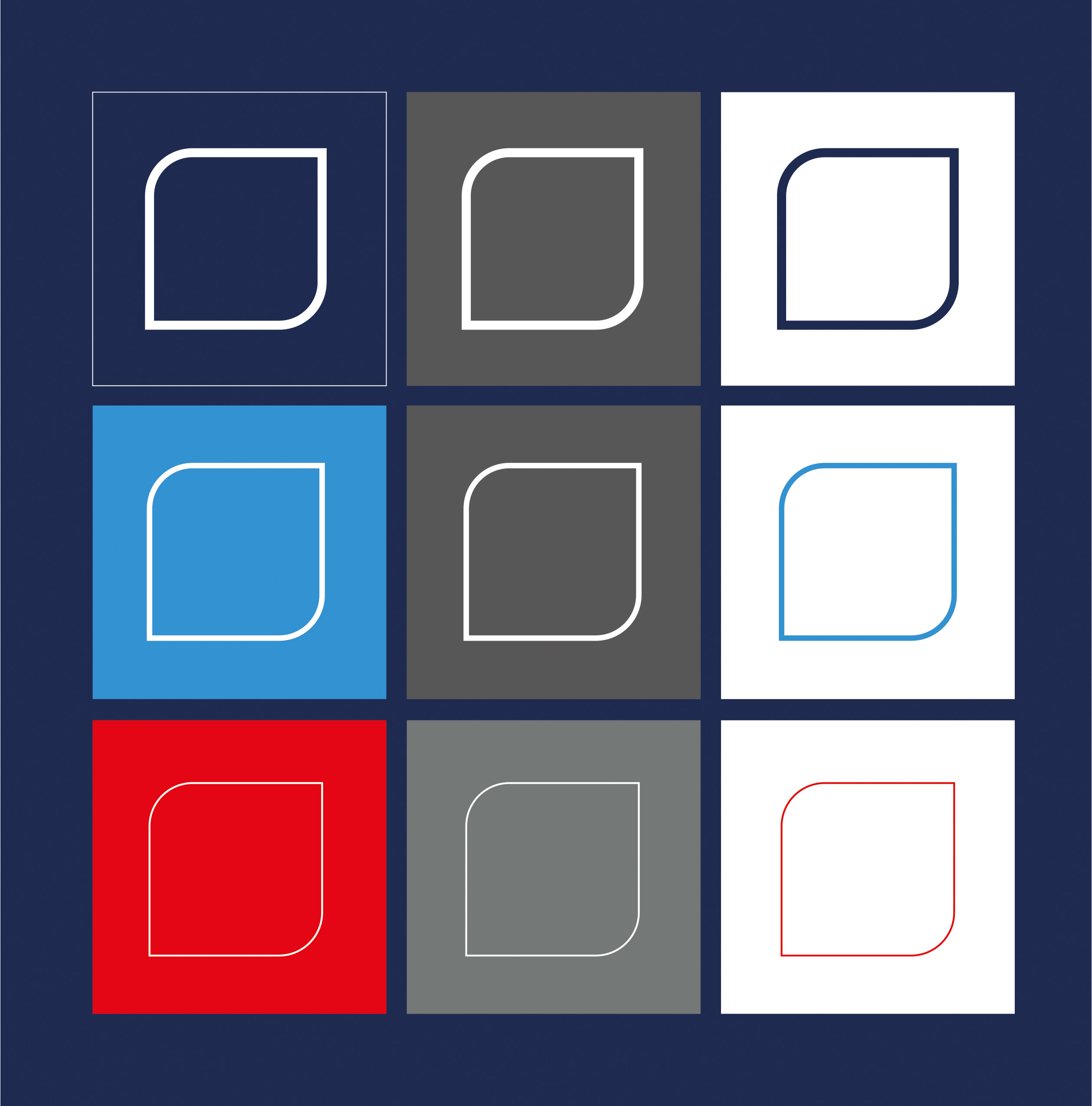
Visual
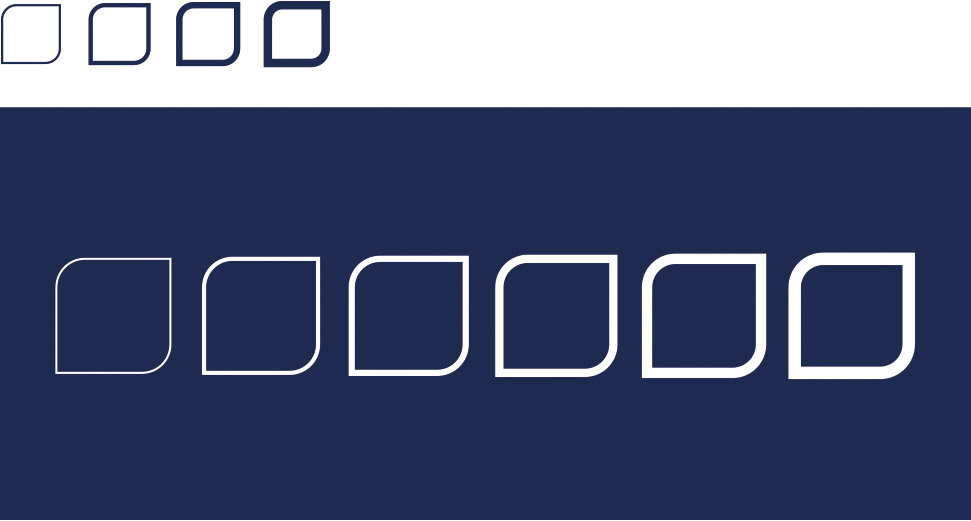
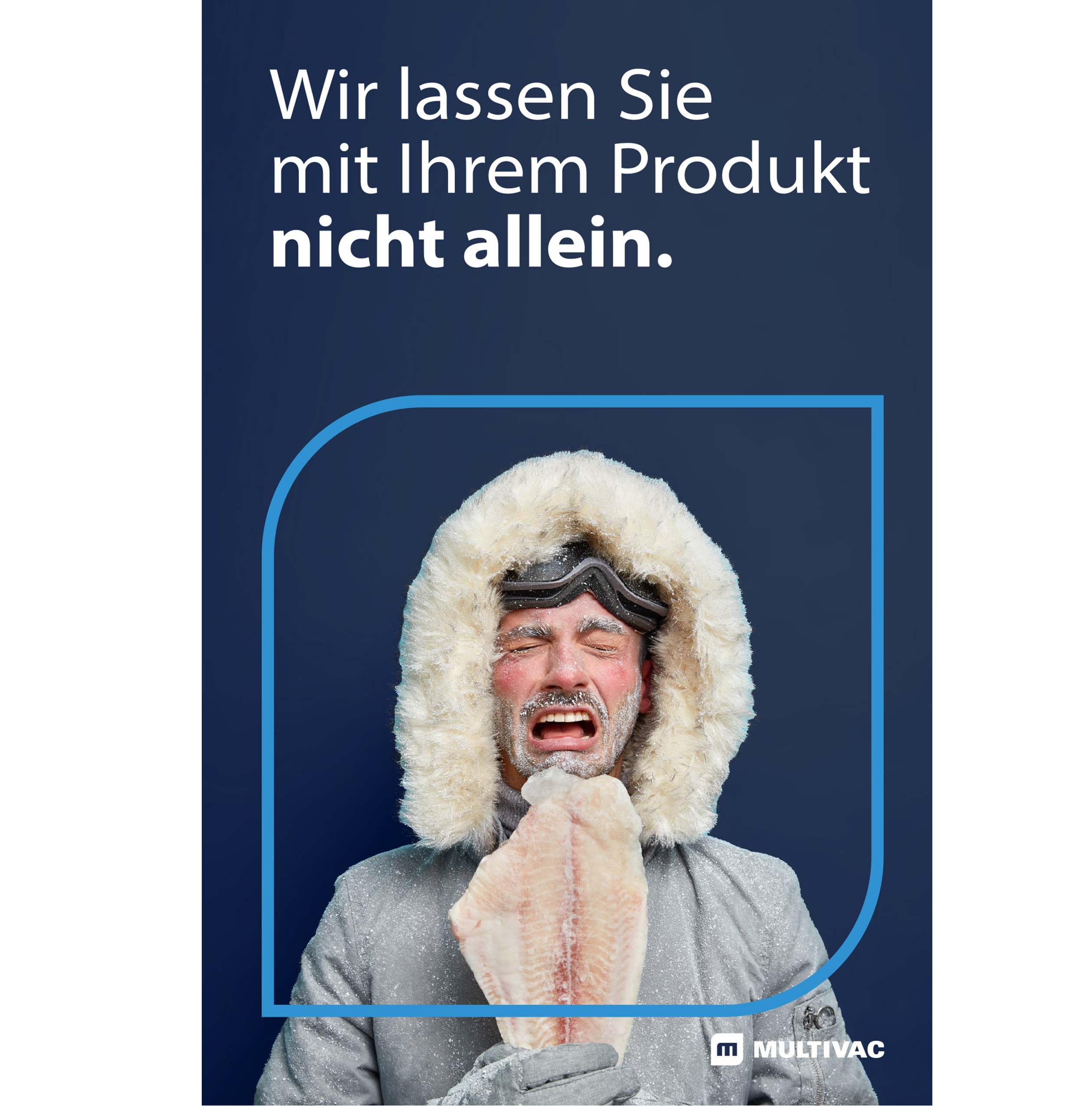
No frills. No effects. And - depending on the background and company segment - simply blue, light blue, red, white or black. The new visual represents MULTIVAC's old figurative word mark and, as a new visual, forms a central key element for representing the brand. It will be used as a visual for all subsidiaries of the MULTIVAC Group.
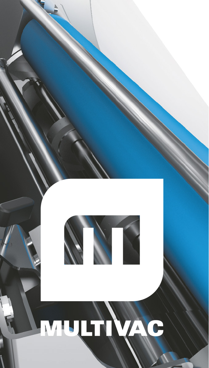
The visual may only be used in combination with the company logo!
Specifications
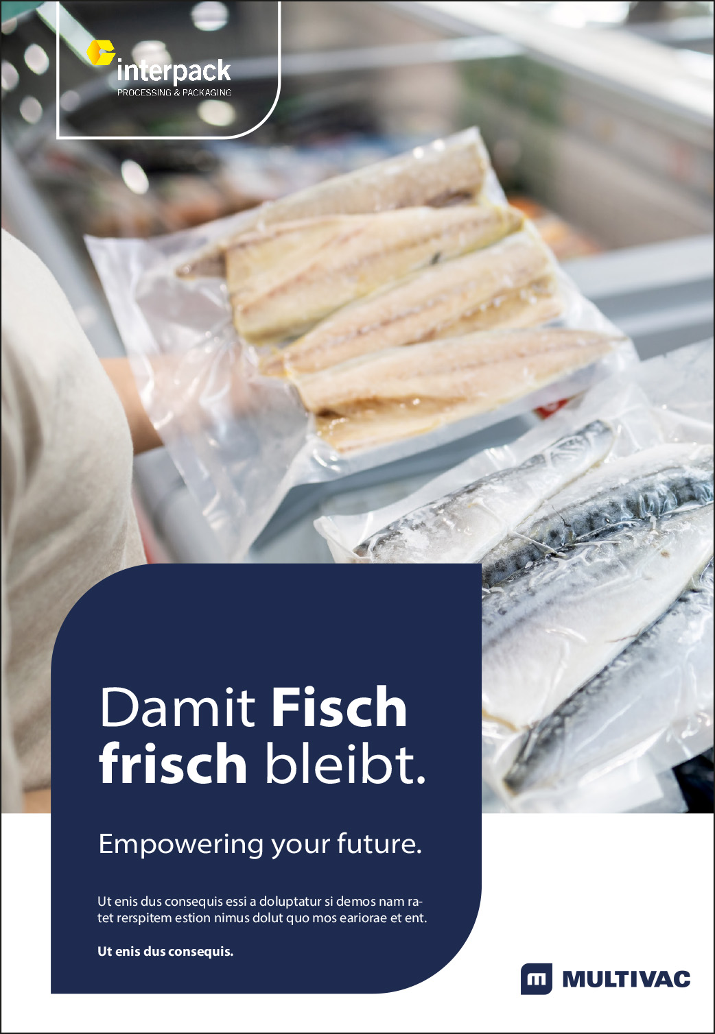
Application example
Visual in the gate
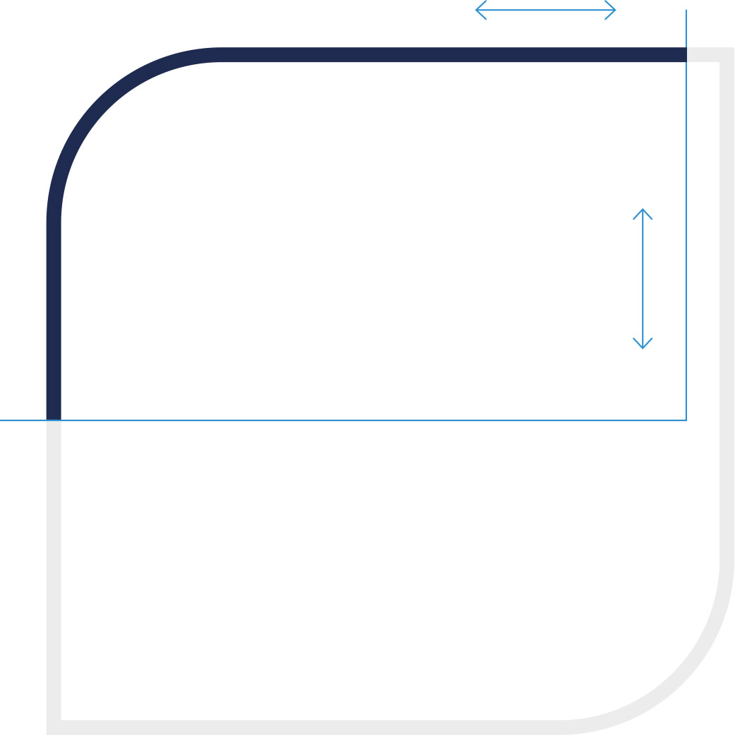
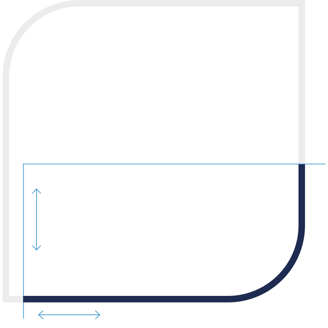
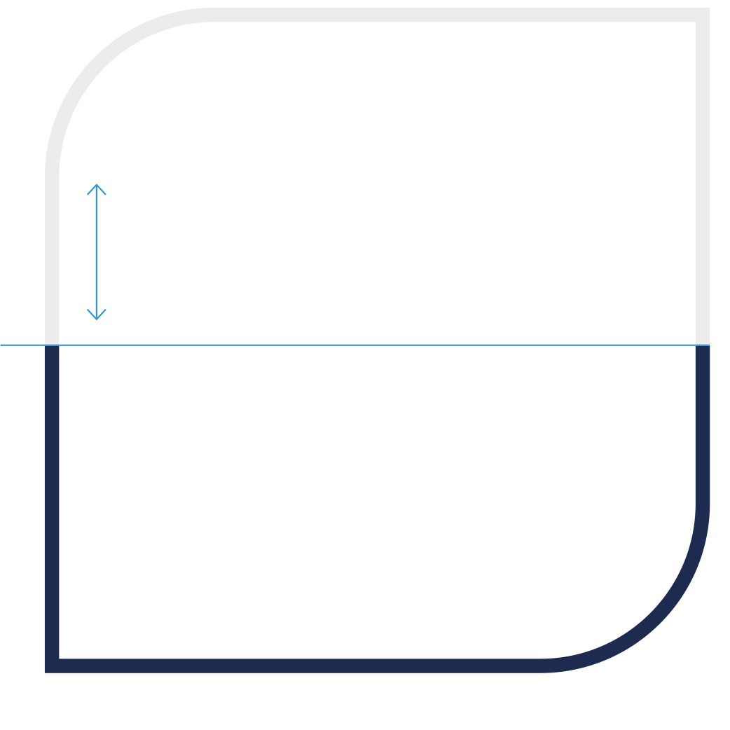
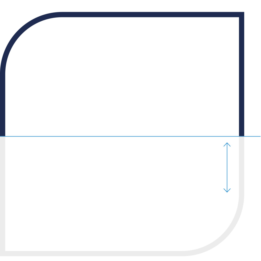
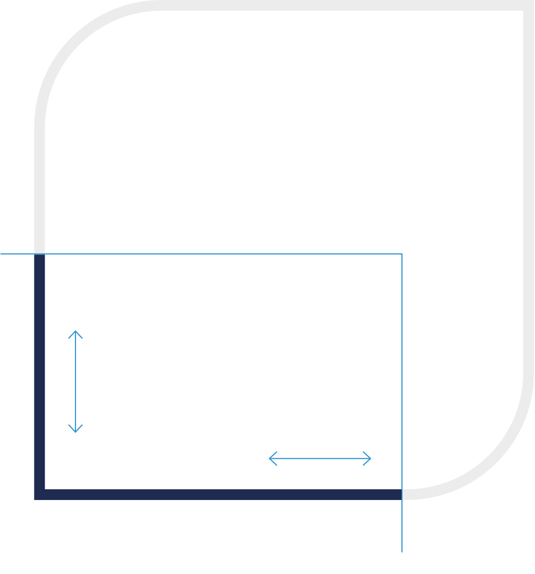
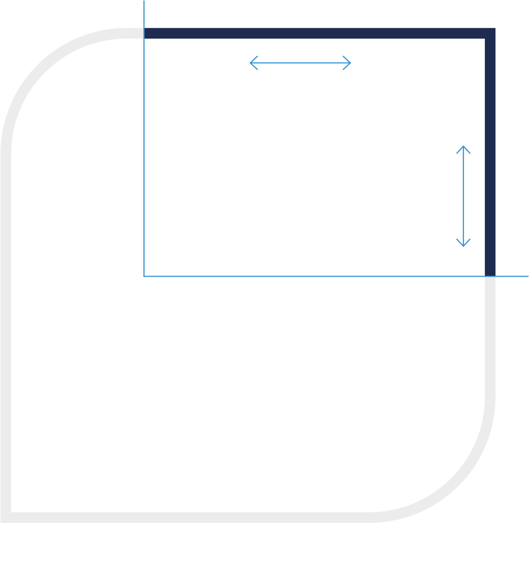
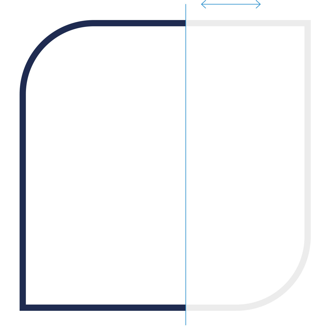
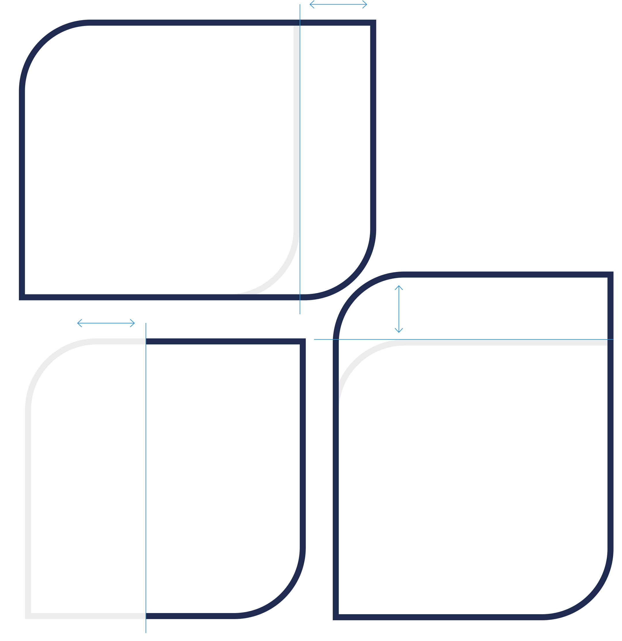
The visual can be cropped horizontally from below|above and|or vertically. The following applies to every bleed: The geometric shape of the brand logo must be clearly recognisable. A bleed that cuts off all rounded corners is excluded. The visual is not cropped by adjacent images and|or areas - unless it is a functional interaction area.
Not allowed
The visual can be cropped horizontally from below|above and|or vertically. The following applies to every bleed: The geometric shape of the brand logo must be clearly recognisable. A bleed that cuts off all rounded corners is excluded. The visual is not cropped by adjacent images and|or areas - unless it is a functional interaction area.
Ratio, minimum size and spacing
Distances
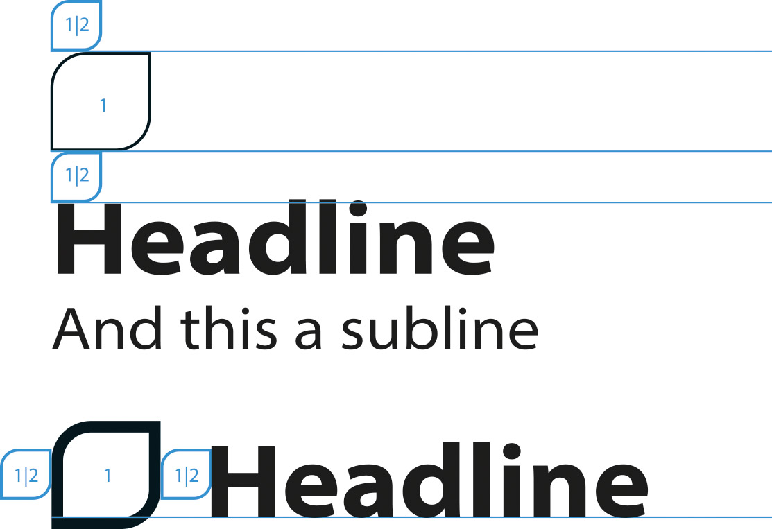
The distance between the visual and the text can be freely selected for an independent appearance of the visual. However, half the height of the visual should be used as the minimum spacing at the top and bottom. The minimum spacing at the left and|or right edge of the visual is also half a width.
Ratio
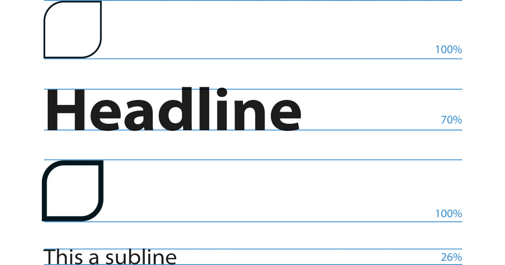
The relationship between the visual and the typography can be freely selected. The visual appears particularly harmonious with the text if the capitalisation height is 70% of the outer height of the visual. Further key figures (26 % and 11.5 %) can be derived from this (see illustration). But this is only a guide.


