


Font
Flexible typography
Bold and loud or reduced and elegant: the font styles of the Myriad Pro allow a wide variety of presentations and moods. Concrete applications are thus even more consistently orientated towards the target group and the respective messages.
Despite the flexibility, the Myriad Pro the uniform brand perception across all contact points - from the use on the brochure to the video. Few elements are more influential in the perception of the brand than Myriad Pro. Used in headlines - from SemiExtended to Black SemiExtended - this typeface is a central recognisable feature of the brand.
The font styles of the Myriad Pro offer great flexibility to map hierarchies in applications in a simple and clear way. In addition, they are not assigned to any machine types, machine classes or business areas. The Myriad Pro is available as a file package with predefined font styles.
Myriad Pro
The Myriad Pro is a font with infinitely variable font weight and width. This special feature creates the basis for flexible use. The typography can be customised depending on the requirements, context or message of an application. For example, the Myriad Pro in digital applications is very space-saving thanks to its flexible font width, as it offers the option of orienting itself to the width of the visible area (the viewport). Readability and contrasts can be improved by adjusting the font size and in animations, the Myriad Pro creative freedom.
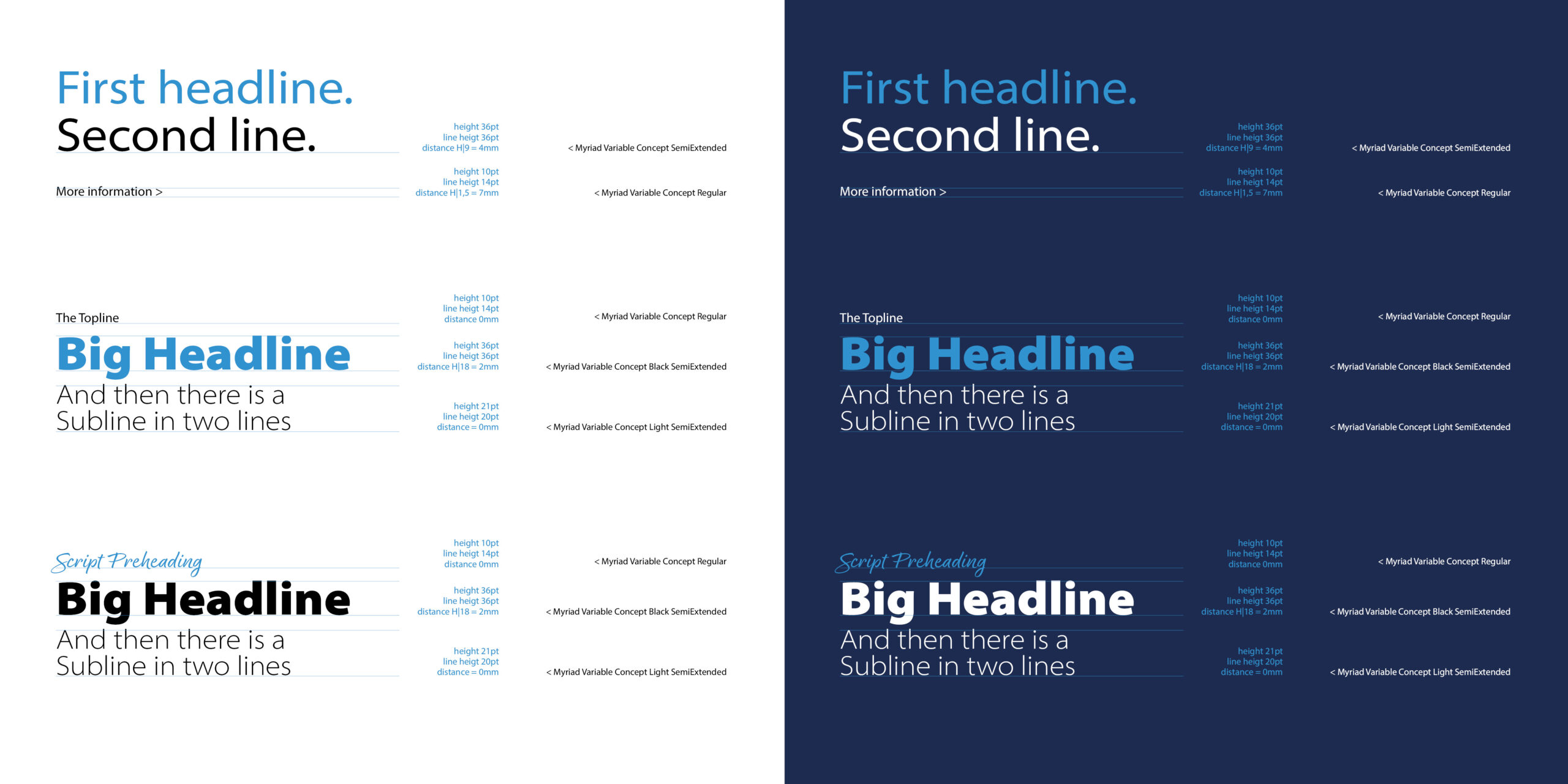
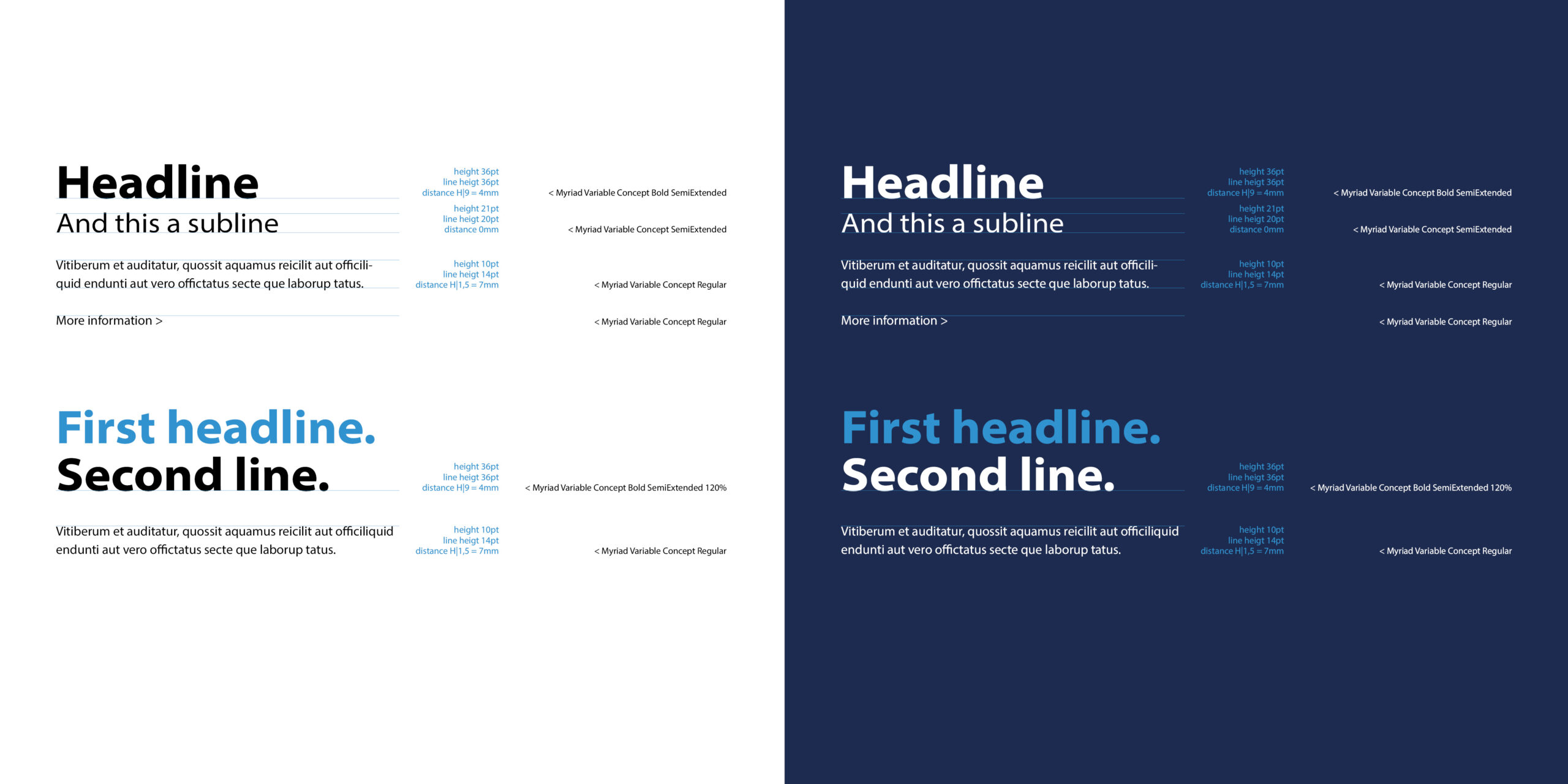
The font style Myriad Pro Black SemiExtended is used for large main headings. The black font is only to be used as Semi Extended. The font weights (Light, Normal to Bold), on the other hand, are freely selectable - to suit the message.
The Myriad Pro works in common applications such as Adobe Creative Cloud and is also available as a web font for use in a digital context.


Application
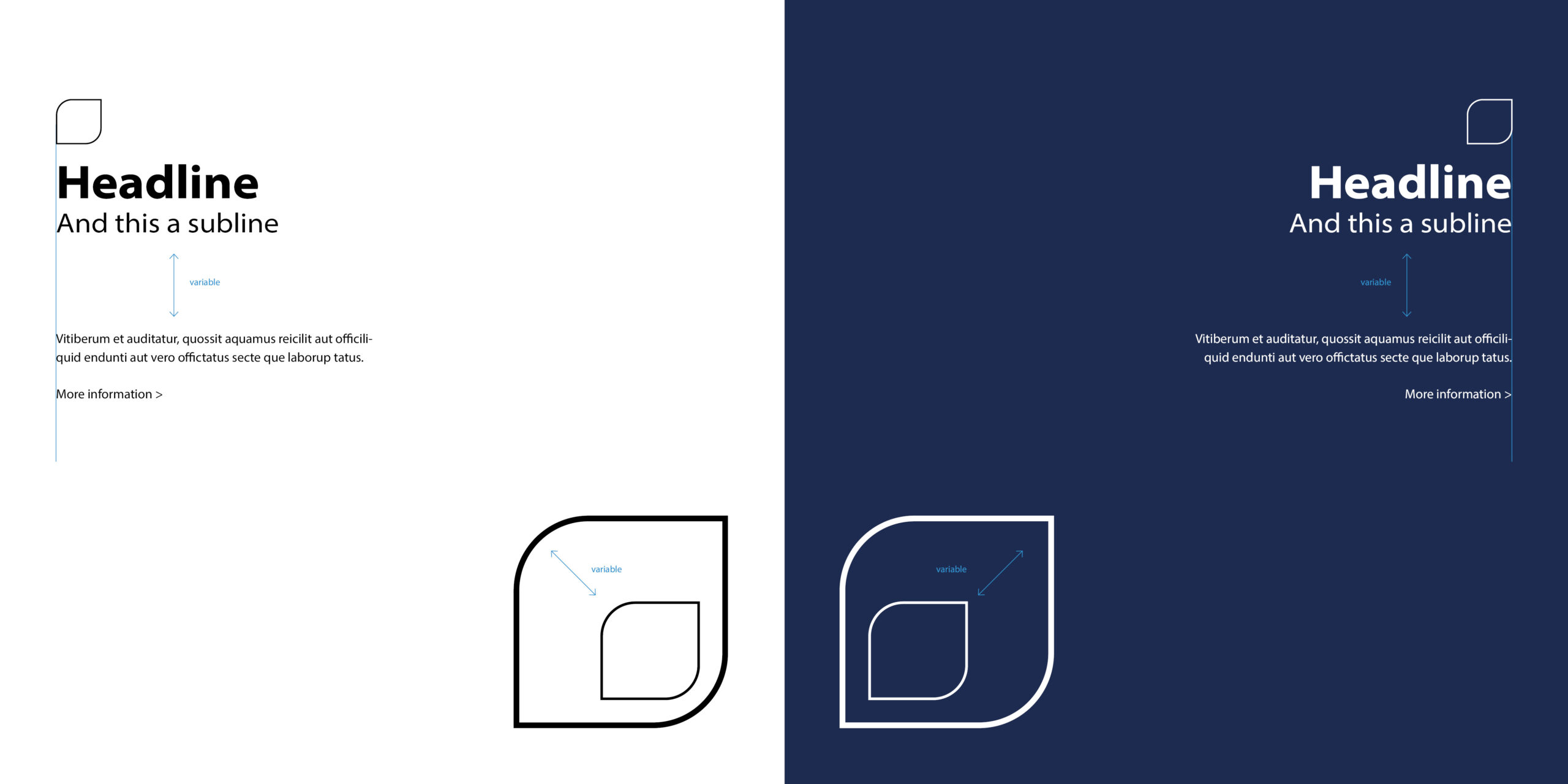
The typography can be set in either black or white. Shades of grey are possible in a digital context for functional reasons. Font sizes, line spacing and spacing between the text hierarchies are freely selectable. A minimum spacing has been defined for all elements. For headlines and sublines, the Myriad Pro is used. The headline can optionally be typographically fine-tuned with an optical spacing of -15.
Typography is always
- wrapped as flutter set
- preferably aligned to the left or right
- and set in mixed notation
The relationship between the key visual and headline is flexible. Accordingly, there are no specifications or fixed ratios in terms of line width and size between the key visual and headline. The only specification relates to the case where the headline is located directly above or below the key visual. In this case, the headline must be aligned with the inner edge of the key visual.
Utilisation
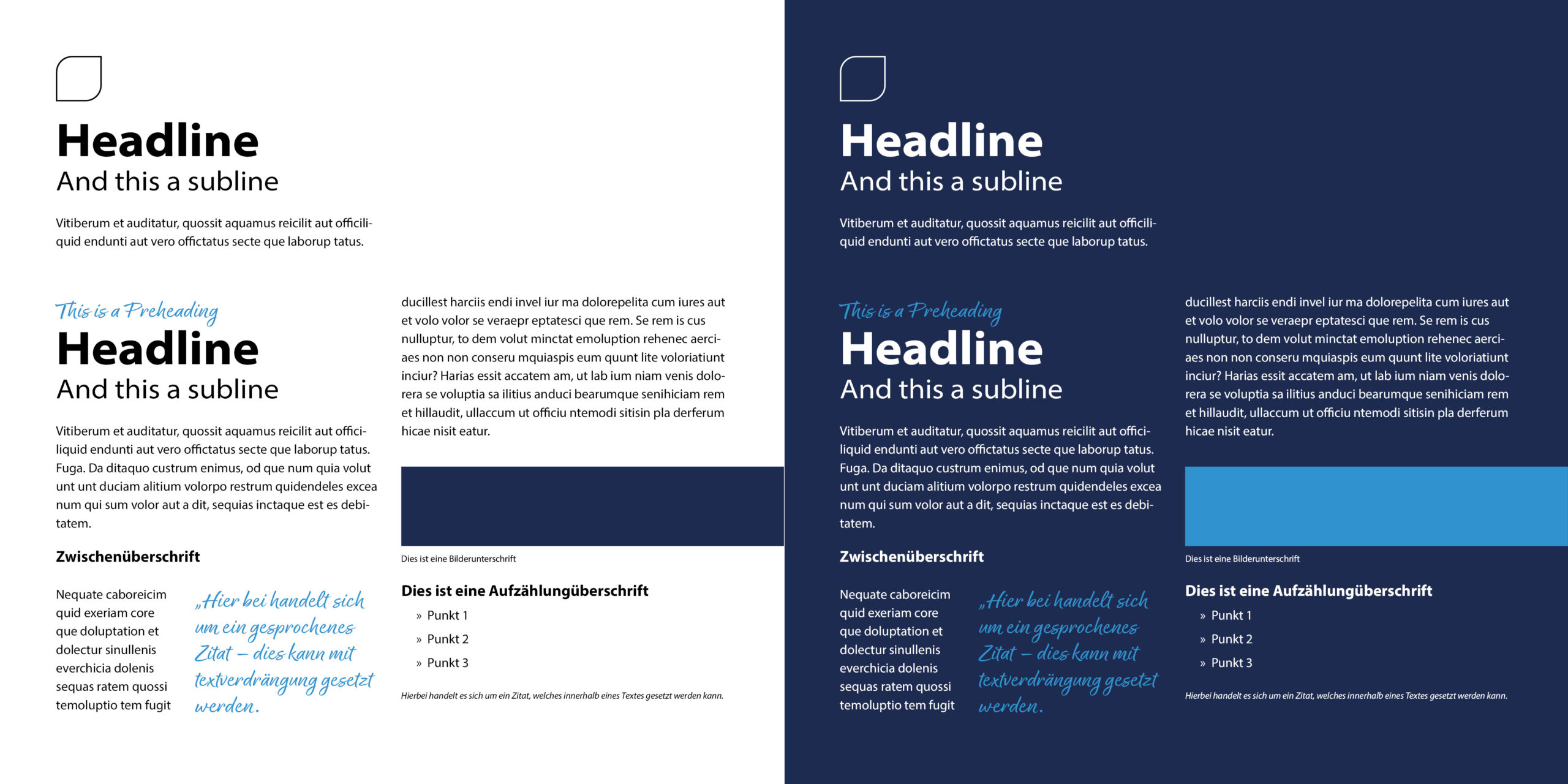
Use of Myriad Pro for individual text elements:
- Headlines and subheadings - in Myriad Pro (Black only as Myriad Pro Black SemiExtended)
- Continuous text - Myriad Pro Regular
- Buttons and Text Buttons - Myriad Pro SemiExtended
- Interactive text elements - Myriad Pro SemiExtended
- Highlighting - Myriad Pro Bold
- Footnote and note text - Myriad Pro Regular
- Quotes - Myriad Pro Normal
Award font
A markup font is available for MULTIVAC, which can be used to display quotations, preheadings or texts with a handwritten character. The Borkishand font is used as the markup font.
Typography is always
- wrapped as flutter set
- preferably aligned to the left or right
- and set in mixed notation


Font data
The MULTIVAC corporate fonts can be downloaded here via the download button.
If your characters are not covered by the MULTIVAC fonts, please contact mc[at]multivac.de


