


FRITSCH Red
RGB: 237 | 28 | 36
HEX: #ed1c24
CMYK: 0 | 100 | 100 | 0
Pantone 1795 C
RAL 3020
FRITSCH grey
RGB: 109 | 116 | 117
HEX: #6d7475
CMYK: 8 | 0 | 5 | 65
Pantone Cool Gray 9 C
RAL 7015
Colours
Colour concept
The FRITSCH brand colour red is used exclusively as a solid colour. It must not be darkened, lightened or displayed as a transparent colour.
The FRITSCH colour grey is used as an accent colour. This applies to text, symbols and illustrations. This colour can be used as a secondary colour in illustrations and graphics. The FRITSCH colour grey is also available in 3 other shades, which are used for illustrations or background areas.


Brand colour
The FRITSCH brand colour red is used exclusively as a solid colour. It must not be darkened, lightened or displayed as a transparent colour.
The FRITSCH colour grey is used as an accent colour. This applies to text, symbols and illustrations. This colour can be used as a secondary colour in illustrations and graphics. The FRITSCH colour grey is also available in 3 other shades, which are used for illustrations or background areas.
FRITSCH Background | Logo Red
RGB: 237 | 28 | 36
HEX: #ed1c24
CMYK: 0 | 100 | 100 | 0
Pantone Black
RAL 3020
FRITSCH accent colour grey
RGB: 109 | 116 | 117
HEX: #6d7475
CMYK: 8 | 0 | 5 | 65
Pantone Cool Gray 9 C
RAL 7015
FRITSCH accent colour | 60%
FRITSCH accent colour | 40%
FRITSCH accent colour | 20%
Secondary colours
In addition to the accent colour grey, there are other secondary colours such as black or white. These colours are used for backgrounds, fonts or illustrations.
Black print
RGB: 0 | 0 | 0
HEX: #000000
CMYK: 40 | 0 | 0 | 100
Pantone Black
RAL 9005
Oracal 702
HKS 88 K
Schwaz Online
RGB: 43 | 43 | 43
HEX: #2b2b2b
White print
RGB: 255 | 255 | 255
HEX: #ffffffff
CMYK: 0 | 0 | 0 | 0
RAL 9010
Oracal 631-98
HKS 44 K
White online
RGB: 252 | 252 | 252
HEX: #fcfcfc
Grey Background Online
RGB: 242 | 242 | 242
HEX: #f2f2f2
Colour weighting
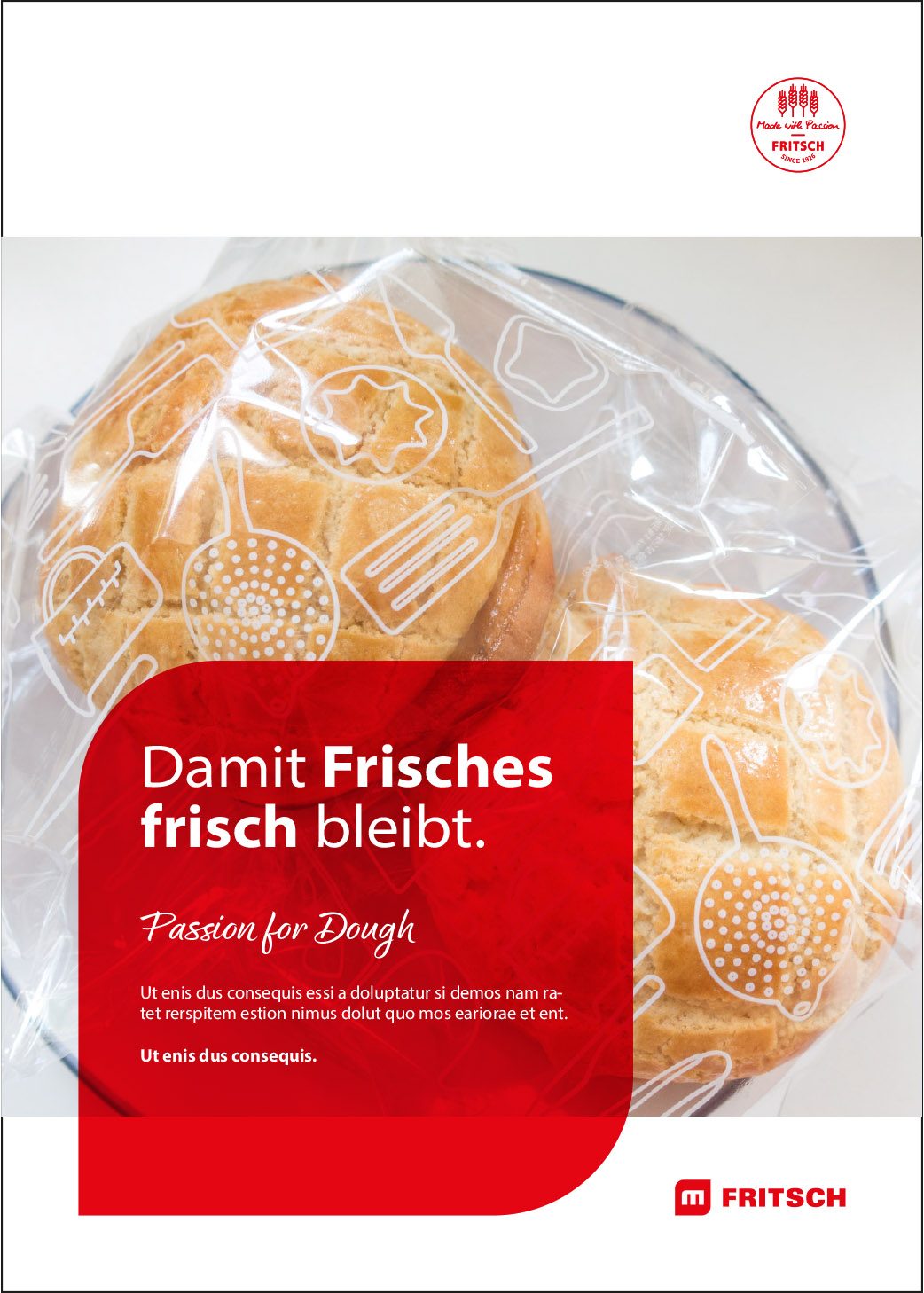
The colour weighting in FRITSCH media should correspond approximately to the area ratio shown. The background colours white and red predominate. Lettering and lines determine the proportion of black. The red colour is used for two-dimensional background illustrations. It is also used as the font colour for headlines. In addition to red, grey can also be used for headings. It is also used for background design or to display illustrations and icons. Red is used as a Call2Action or action area. Ideally, the photographs should also fit into this colour harmony.


Possible colour combinations
Due to the poor contrast, no black text may be placed on a dark blue background or dark blue text on a black background.


